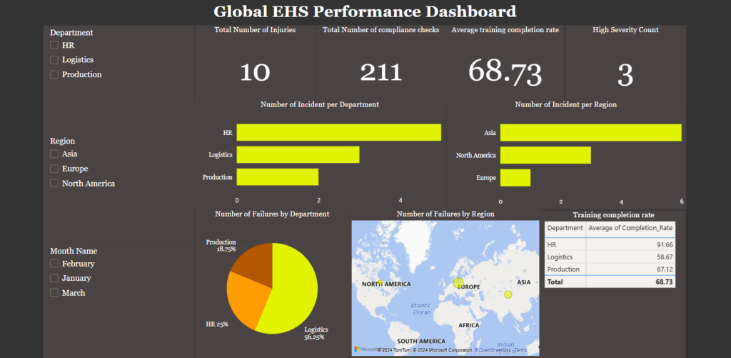
Workplace safety and compliance are critical metrics for organizations operating across multiple regions and departments. The Global EHS Performance Dashboard created in Power BI provides a high-level overview of injury incidents, compliance checks, and training completion rates, enabling decision-makers to take actionable steps toward a safer and more compliant workplace.
In this blog, we’ll break down the key components of this dashboard, explain how it was designed, and discuss the insights it provides.
Objective of the Dashboard
The goal of the dashboard is to present a comprehensive overview of EHS (Environmental, Health, and Safety) metrics on a single page, making it easy for stakeholders to:
- Monitor incident trends.
- Identify high-risk regions and departments.
- Assess compliance performance.
- Evaluate training effectiveness.
Key Features of the Dashboard
The dashboard uses a combination of visuals to provide insights into workplace safety and compliance performance. Below are the key sections and their interpretations.
- KPI Cards:
- At the top of the dashboard, four KPI cards display critical metrics:
- Total Number of Injuries (10): Provides an aggregate count of all recorded incidents across regions and departments.
- Total Number of Compliance Checks (211): Tracks the total compliance checks conducted during the reporting period.
- Average Training Completion Rate (68.73%): Highlights the average completion rate of safety training programs across all departments.
- High Severity Count (3): Shows the total number of high-severity incidents that require immediate attention.
- These metrics provide a quick snapshot of the organization’s overall safety performance.
- At the top of the dashboard, four KPI cards display critical metrics:
- Bar Charts:
- Number of Incidents by Department
- This bar chart highlights which departments (HR, Logistics, Production) experience the most incidents:
- Logistics leads with the highest number of incidents, indicating a need for closer monitoring or intervention in this area.
- Number of Incidents by Region
- This chart categorizes incidents by geographical regions (Asia, North America, Europe):
- Asia has the highest count of incidents, suggesting it might be a hotspot for safety risks.
- Pie Chart:
- Number of Failures by Department
- The pie chart shows the distribution of compliance failures among departments:
- Logistics accounts for 56.25% of compliance failures, the highest among all departments.
- Production and HR contribute 18.75% and 25%, respectively.
- This visualization helps pinpoint areas with the greatest compliance challenges, enabling focused corrective actions.
- Map Visualization:
- Number of Failures by Region
- A geographical heat map pinpoints regions with compliance issues. Each bubble’s size corresponds to the number of failures:
- Asia and North America emerge as regions with significant compliance failures.
- This insight aids in regional planning and resource allocation for compliance improvements.
- Training Completion Rate:
- The table visual at the bottom right summarizes average training completion rates by department:
- HR boasts the highest completion rate at 91.66%, reflecting strong adherence to training programs.
- Logistics lags behind at 58.67%, indicating a potential training gap.
- The total average completion rate of 68.73% suggests room for improvement across all departments.
- The table visual at the bottom right summarizes average training completion rates by department:
Design Choices
Why a Single-Page Dashboard?
A single-page design ensures that key metrics are presented at a glance, making it ideal for senior management and safety officers. Users can filter data interactively by:
- Department
- Region
- Month
This dynamic filtering capability enhances usability and relevance.
Conditional Formatting
- Severity levels in the KPI cards and visuals are highlighted using conditional formatting (e.g., dark red for high severity) to draw attention to critical issues.
Actionable Insights
The dashboard enables stakeholders to:
- Identify High-Risk Areas: Logistics and Asia require targeted interventions to improve safety and compliance.
- Enhance Training Programs: Departments with low training completion rates, like Logistics, need prioritized training efforts.
- Improve Compliance: Departments with high failure rates should undergo compliance reviews and audits.
Conclusion
This Power BI Global EHS Dashboard is a powerful tool for monitoring workplace safety, compliance, and training across regions and departments. By consolidating multiple metrics on a single page, it empowers organizations to make data-driven decisions that promote a safer and more efficient work environment.
If you’re looking to create similar dashboards or improve your organization’s data visualization capabilities, feel free to reach out or leave a comment below!
