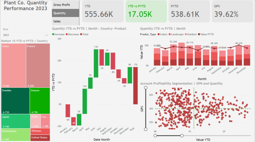
In the ever-evolving financial landscape, leveraging data effectively has become critical for managers aiming to optimize performance and drive strategic decision-making. The Plant Co. Quantity Performance 2023 Dashboard, developed using Power BI, is a stellar example of how advanced data visualization can empower managers to make smarter, faster, and more informed decisions.
This blog explores how financial services managers can utilize this dashboard to extract actionable insights and make decisions grounded in real-world data.
A Clear Overview of the Dashboard
This Power BI dashboard presents a holistic view of key performance indicators (KPIs) such as Year-to-Date (YTD) performance, profitability (GP%), and quantity trends. By offering interactive visualizations, it enables stakeholders to dissect metrics across time periods, regions, and product categories.
Key features include:
- Comprehensive KPIs: Metrics like YTD and PYTD allow managers to assess growth trends effectively.
- Regional Analysis: Identifies high- and low-performing areas to help refine regional strategies.
- Profitability Analysis: Highlights the relationship between profitability (GP%) and quantity sold, helping pinpoint areas needing immediate attention.

How Financial Managers Can Use This Dashboard
1. Analyzing Year-to-Date (YTD) Performance
The dashboard prominently showcases critical KPIs such as:
- YTD Quantity: 555.66K units sold.
- Growth: A positive 17.05K YTD vs PYTD, signaling upward momentum.
- Gross Profit (GP%): A healthy profitability margin of 39.62%, demonstrating strong financial health.
Actionable Insight:
A financial services manager can track these metrics monthly to adjust budgets, plan investments, and ensure that growth aligns with business targets. For instance, the 17.05K growth highlights an opportunity to replicate strategies driving success in specific regions or product lines.
2. Spotting Underperforming Regions
The treemap visualization provides a clear snapshot of regions underperforming in terms of quantity sold. For instance:
- China: A shortfall of -9.76K units.
- France: A dip of -9.36K units.
Actionable Insight:
Managers can analyze these regions more deeply to understand whether challenges stem from supply chain issues, changing customer preferences, or macroeconomic factors. A financial manager in charge of loans for regional businesses could develop localized campaigns or reassess credit policies to stimulate growth in these markets.
3. Monitoring Product Performance
The waterfall chart visualizes monthly trends, highlighting gains and losses. Key observations include:
- Significant gains in March (+13K units) but notable dips in July (-8K units).
Actionable Insight:
This trend analysis allows managers to:
- Increase inventory or financial support (e.g., loans) during high-performing months like March.
- Investigate reasons behind dips in months like July and implement corrective measures such as promotional campaigns or operational changes.
4. Understanding Profitability and Quantity Relationships
The scatter plot connects GP% with the quantity sold across all products. Patterns reveal clusters of:
- High-quantity, low-GP% products, which may dilute overall profitability.
- Low-quantity, high-GP% products, which represent untapped potential for higher revenue.
Actionable Insight:
Managers can optimize product portfolios by:
- Introducing pricing adjustments for high-quantity, low-GP% products.
- Allocating marketing resources to promote high-GP% products to increase their sales volume.
Why Power BI Stands Out for Business Decision-Making
Financial services managers require tools that offer both functionality and flexibility. Power BI excels in meeting these needs:
1. Interactive Visualizations
Power BI’s interactive elements allow users to drill down into specific data points. For example:
- Managers can filter the dashboard to focus on landscape products in Q1, identifying seasonal performance trends and planning targeted campaigns.
2. Unified Reporting
Instead of juggling multiple spreadsheets, this dashboard consolidates profitability, quantity, and sales data into a single view.
3. Customization for Specific Needs
Power BI dashboards can be tailored to meet unique business goals, such as:
- Monitoring branch-level profitability.
- Tracking loan disbursement trends for specific industries.

Real-World Applications for Financial Services
Let’s break down how this dashboard can translate into measurable business outcomes:
1. Optimizing Regional Strategies
For regions like China and France (highlighted as low performers), a financial manager might:
- Collaborate with local sales teams to design region-specific strategies.
- Evaluate market conditions and customer segmentation to better allocate financial resources.
2. Supporting Product-Specific Decisions
The data reveals that landscape products consistently perform well. Managers can use this insight to:
- Prioritize these products for financing solutions like business loans.
- Allocate larger budgets for inventory during peak seasons.
3. Driving Profitability Improvements
By focusing on clusters of low-GP%, high-quantity products, managers can:
- Negotiate with suppliers for better terms.
- Introduce tiered pricing to ensure sustainable margins.
How to Integrate This Dashboard into Business Processes
- Schedule Regular Reviews
Incorporate the dashboard into monthly or quarterly meetings to align teams on KPIs and identify actionable opportunities. - Foster Cross-Department Collaboration
Share insights with marketing, risk, and operations teams to create cohesive, data-backed strategies. - Utilize Predictive Analytics
Leverage the trends identified in this dashboard to develop predictive models for forecasting future performance.
Conclusion
The Plant Co. Quantity Performance Dashboard is more than a collection of charts and graphs—it’s a strategic tool tailored to drive business success. For financial services managers, this dashboard offers clarity, actionable insights, and the ability to respond proactively to challenges and opportunities.
By harnessing the power of Power BI, financial managers can transform raw data into valuable business strategies, ensuring their organizations remain competitive and future-ready.
Ready to revolutionize your decision-making process? Start today by exploring how Power BI can reshape your approach to data-driven management.